Sunday, 2 February 2014

Bibliography

Websites:

Inspiration - http://123inspiration.com
                 - http://cuded.com
                 - http://www.npg.org.uk/collections.php
                 - http://www.npg.org.uk/whatson/exhibitions/bp-portrait-award-2014.php
Stephen Shankland - http://www.stephenshankland.com/Paintings/Paintings_1.html
                              - www.comptemporaryjerseyartists.com
Vincent Giarrano - http://www.giarrano.com/gallery.html
Richard Geraint Evan - http://www.richardevansart.com/gallery.html
Esra Rosie - http://esrarosie.com/portfolio
Leslie Watts - http://www.lesliewatts.ca/people.html
Mark Stewart - prafull.net
                      - markstewart.deviantart.com
Nick Lepard - http://nicklepard.com/archives/gallery-category/paint
Piet Van Den Boog - http://www.vandenboog.com/vandenboog.com/Works/Works.html
                              - http://www.vandenboog.com/vandenboog.com/Works/Pages/overview_2007-2010.html
Christoffer Relander - http://www.christofferrelander.com/
Jangmai - http://jangmai.deviantart.com
Karsten Thormaehlen - http://123inspiration.com
Ed Fairburn - http://edfairburn.com/
Kris Trappeniers - http://banksyforum.proboards.com/thread/98958/kris-trappeniers-stencil-spraypaint-papercut
                          - http://senseslost.com/2011/06/08/stencil-portraits-by-kris-trappeniers/
                          - http://monemo.ru/culture/kris-trappeniers-kris-trappeniers-bumazhnyy-skulptor/
Mark Powell - http://www.markpowellartist.com/
Colin Davidson - http://www.colindavidson.com/index.php?do=betweenthewords/index

Final Posting: Collection of Work


Evaluation

The research through my sketch book lead me to produce my final piece on the elder generation. I chose to paint someone with character and with skin that looks worn and experienced. I was inspired by many artists which linked and connected to one and other in many different way, I decided to paint my portrait in the style of Colin Davidson as he was my favourite artist, not only because of his style and technique but because of the material he chose to paint on. I used a large piece of calico for my portrait. I painted with a similar technique and colour palette to that of Colin Davidson and Piet Van Den Boog, using a flat brush to layer different tones to blend.

I chose to paint on calico instead of paper or board because of the texture which is created. As I progressed through the artist research I became particularly attracted to the texture produced by the work. When the layers of paint are dried on the fabric the surface draws in the viewer and not only make the portrait something you appreciate visually but also through touch. 

I'm happy with the way my final portrait has turn out. I think I was successful in capturing the expression of the face, I like the way I painted the hair by layering the individual strokes for each strand. I'm glad I decided to use a larger scale for my portrait although it did make the process longer and harder when it came to visualising the final outcome. While I like the detail created by painting the hair in this style, if I were to criticised my own work I think the technique does not fit in with the way I've painting the face. If I were to start again I may have also considered using a lighter less "pink" colour palette, similar to artists such as Karsten Thormaehlen and Richard Geraint.

As my initial idea was to do a holiday time line, I lost time researching into artists which weren't really relevant to my final project theme. Although all the artists I researched link to one and other I think my strongest area within the project is painting, therefore it would have made  more sense looking into artists who paint. I think I could of managed my time better by considering artists which related more closely to my project brief, for example Esra Roise does not do any studies of old people and is a more of a  fashion, illustration artist. However the artists I researched do show a varied range or material and techniques which ultimately lead to my final outcomes. 

I was influenced by all the artists I researched in many different ways, starting with Richard Geraint Evans, he inspired me to look at the human face in different ways, from different angles and capturing a varied range of expressions. Followed by Mark Stewart, the artist who first motivated me to consider older, more wrinkled faces through his magnificent pencil drawings. I particularly enjoyed drawing the more mature faces as they have more detail and depth. I was then lead to look at different ways of painting textured skin. Piet Van Den Boog and Karsten Thormaehlen were two very contrasting portrait artists, one using dark tones and thick layers of paint and the other a photographer capturing a life like double, I was inspired to paint  the delicate faces with a more harsh, thick layer of darker paint. Ed Fairburn was the beginning to my experimentation with different backgrounds and surfaces, inspiring me to look at texture and not just the visual appearance of the final outcome. 


Development of Final Portrait on Calico

I chose to take photos of Gerald as I think his face and skin reflect the texture and story of an old person. As you can see in the photos he looks like someone who has "experienced the world". I predominately like the way he has stubble growing all over his lower face. 


I wanted to paint a portrait in the style of Colin Davidson in the same way I produced the series on painting as mentioned in the precious posting. However I wanted to make a statement and create a portrait in a larger scale. 


Primarily I draw out the outline of the face in the same way as the small painting, although I did find it a lot harder to visualise as you have to look from a distance to see the shape forming.


 I used a similar colour palette to the one I used before for the other smaller portraits. 

I started with the eye and I'm working my way around the face.

When it comes to the stubble and hair I painting a little under layer with a skin tone and then worked on top with a thin paint brush. I painting it hair strand by strand making the face look as life like and as three dimensional as possible.

I found the odd shape of the cheek particularly hard. I also had to revisit the highlights on near the nose to lighten them to show contrast within the face.


Now the face is finished. I left the forehead to the end as I need to blend the forehead and the hair together, in other words, I need to paint a base coat so I can then work the hair stands on top.

I'm happy with the way the face has turned out, especially the facial hair.


Development of Outcomes: Series of Small Portraits on Calico

Looking at artists such as Mark Powell and  Ed Fairburn inspired me to think about different media that could be used as a background to a portrait. While looking through different artists I was drawn to Colin Davidson. He tends to use oil paints on linen to produce his portraits. I was particularly interested in the texture the paint created on the fabric.

I love the way Colin Davidson has applied the paint, using
different techniques to add a varied range of  brush strokes
to create the "blurry", "faded" effect.
I want to experiment with painting onto fabric. I decided to produce a series of paintings by Colin Davidson onto calico with the idea of producing a bigger portrait of my own.

I started by looking at the way Davidson paints his portraits. The initial process he used was to draw out the face and shade the different tones.


I then draw the out line of the face onto a piece of calico.
At first I found it difficult to mix the right tones as they
come out a lot stronger fabric.


As I produced more of the painting I found the technique of layering the paint very quick in comparison to when I blend tones to create a flatter continuous colour.

I carried on making more of theses paintings on A4 size calico.


Monday, 20 January 2014

Initial Ideas and Development of Outcomes: Paper Cuts


Biro artist Mark Powell. Focuses his work
on drawing portraits onto old
envelopes and documents.
After looking at biro artist Jangmai I was interested in looking at other artist who create portraits by using lines and cross hatch. This initial research lead me to look at the work of Ed Fairburn and Mark Powell. I love the way simple line drawings can produce detailed portraits.


Ed Fairburn. Emphasises lines on a map
to create the shape of a face.


 Looking at these artist give me the idea to look at paper cut artist Kris Trappeniers. I wanted to create a massive paper cut which I could then hang from the ceiling. As the light shines through the paper cut an interesting shadow with form.


 I started by photocopying each section of the face to produce the big, A0, size portrait stencil. I then stuck all the section together and start the cut out, beginning with the centre of the face and then working my way out. I found the smaller sections harder to cut away and a lot more time consuming.


Development of Outcomes: Portrait


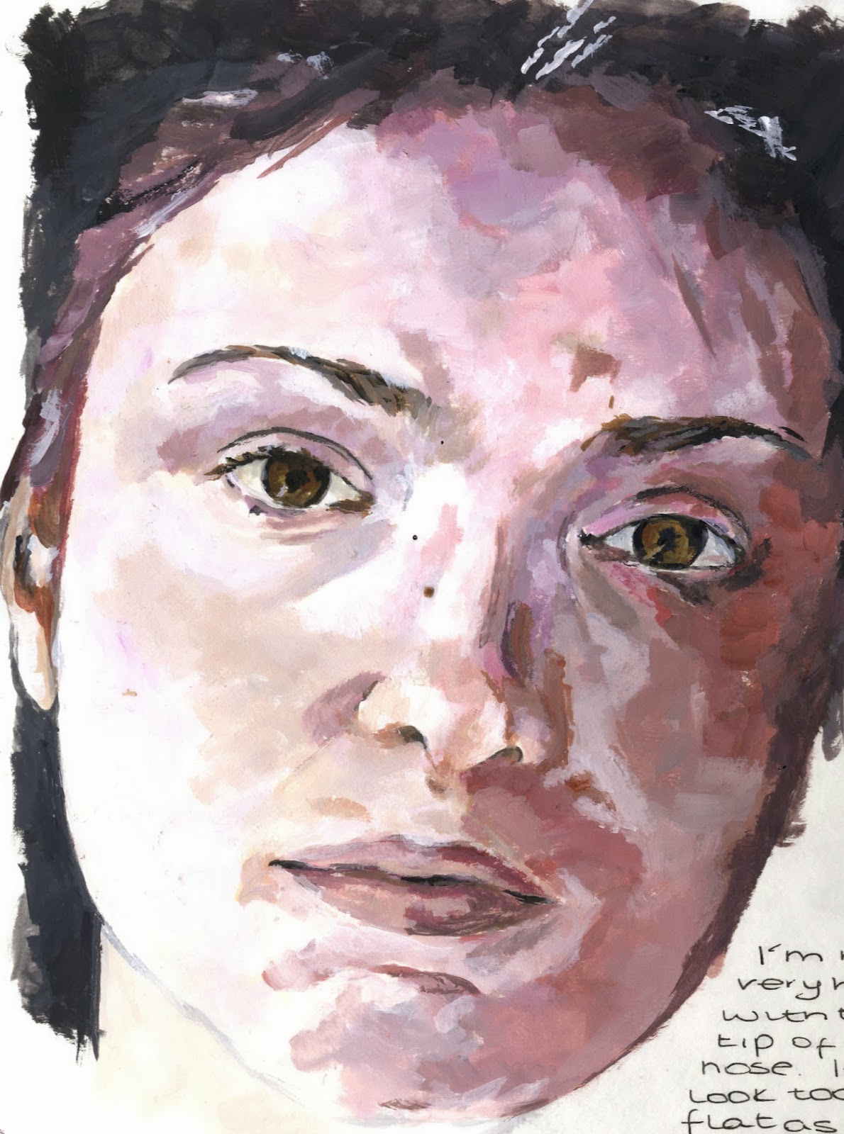
I started my portrait from the eye. I then worked around the face in
small sections. I chose to do this because of the way I was placing
the paint on the paper, I built up the detail as I went a long.


I had a bit of trouble when it came to the
highlights on the nose. It was different to blend the tones to make the face look natural.
 
 
I'm not to happy with how the lips have turned out. I used a smooth technique which make them look less detail compared to the rest of the face.
 
 
I'm particularly happy with the way I dealt with
 the wrinkles and used colour to show the shape.
 
For the hair I applied a light layer of creamy white and then worked on top with the greys.

Reviewing and Refining Ideas

My painting of a study by Piet Van Den Boog
After exploring different medias and looking at a varied range of artist, I decided to produce an outcome inspired by Piet Van Den Boog. I started by taking photos in a similar style to his paintings. Although I was trying to portray a similar theme as Van Den Boog, I still wanted to continue looking at the elder face.


I chose this particular photo because of the way the head this tilted backward, bringing focus on the wide eyes. I used the same technique, using a flat paint brush, and similar colour palette as Piet Van Den Boog.


I'm happy with the final outcome, I really enjoyed painting in this style, one I wouldn't have particularly chosen to paint with before. If I were to change or refine my portrait I would have painted the background darker with more shadows which would better link the outcome to the artist that inspired me.

Thursday, 12 December 2013

Initital Ideas

With the older face I was able to show more detail
when drawing the skin because of the wrinkles
and imperfections.
 
I looked at the work of Mark Stewart, a portrait artist who uses pencils rather than paint. I wanted to explore a different media. While researching his work I was particularly drawn to the older faces as I felt they created more texture and tell more of a visual story.


I'm happy with the way I blended the tones and shadows by
using different pencil gradients.


This artist then led me to Nick Lepard an artist who paints portraits by layering colour, creating lines within the different tones. This style of painting shows the worn and rough areas of the faces, similar to those found on older people.


In the two portraits above I used acrylic paint applying it with
a flat brush for the faces. I then used various colours of ink
to create the dark backgrounds.


After researching these artists I decided to focus my project on the elder as I think their faces show more expression and emotion whilst telling a story of experience.


Wednesday, 11 December 2013

The Initial Research

To start my project I looked at an artist who paints portraits and landscapes of beach and holiday themes. I was particularly drawn to the composition of Stephan Shankland's paintings, he doesn't just concentrate on the human figure but also spends a lot of time on the landscape and backgrounds. Vincent Giarrano is a similar artist who I was attracted to because of the more traditional sceneries. 
Shankland, in contrast to Giarrano, tends to use more vibrant colours to creating a more eye catching painting.


This is a photo of the landscape I painted by Stephan Shankland.
The use of a flat brush enabled me to mix colour and tone while creating texture. 


I used coloured pencils to draw this portrait. I used
 a cross hatch technique to create the shadow on the
face and to give the cheeks more of a three dimensional
realistic look.

The Third artist I researched was Richard Geraint Evans. I wanted to look at a more portrait based painter. I love the way Evans portraits show emotion and how he experiments with different angles of the face. He uses a very realistic technique when painting, with a lifelike colour palette.


This is a painting I did of one of Richard Geraints portraits.
I found painting the faces with a thicker layer of paint easier
then layering up watered down acrylic.


All of the artists above inspired me to take photos while I was on holiday. I wanted to not only focus on the stunning landscapes but I also wanted to capture the natural facial expressions and emotions of different friends and family members.


Monday, 11 November 2013

Project Brief

I chose the project brief of visual stories as I felt it was a broad theme which I could lead into any direction. One of my initial ideas was to create a visual time line of my summer holiday. I was going to collect Spanish newspapers and post cards as well as taking picture of the scenery and local people. While exploring this idea I started to think about the different why people are brought up. Which gave me the idea of human growth, the way people change from childhood through to adulthood, at this point I realised that I wanted to concentrate and create a portraiture based project. 


During the brainstorming period I watched a documentary on the lives of criminals which made me consider the idea of creating a visual story on the victims family and the passed life of the killer. However when I thought about how I could express this through art I came to a point when I realised it wouldn't be possible to create a personal response through primary research. I then thought about old people as it was something I could capture visually and I could also incorporate their memories and life stories through talking to the individual.