Monday, 20 January 2014

Initial Ideas and Development of Outcomes: Paper Cuts


Biro artist Mark Powell. Focuses his work
on drawing portraits onto old
envelopes and documents.
After looking at biro artist Jangmai I was interested in looking at other artist who create portraits by using lines and cross hatch. This initial research lead me to look at the work of Ed Fairburn and Mark Powell. I love the way simple line drawings can produce detailed portraits.


Ed Fairburn. Emphasises lines on a map
to create the shape of a face.


 Looking at these artist give me the idea to look at paper cut artist Kris Trappeniers. I wanted to create a massive paper cut which I could then hang from the ceiling. As the light shines through the paper cut an interesting shadow with form.


 I started by photocopying each section of the face to produce the big, A0, size portrait stencil. I then stuck all the section together and start the cut out, beginning with the centre of the face and then working my way out. I found the smaller sections harder to cut away and a lot more time consuming.


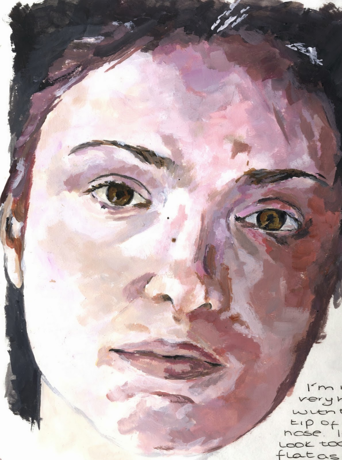


Development of Outcomes: Portrait


I started my portrait from the eye. I then worked around the face in
small sections. I chose to do this because of the way I was placing
the paint on the paper, I built up the detail as I went a long.


I had a bit of trouble when it came to the
highlights on the nose. It was different to blend the tones to make the face look natural.
 
 
I'm not to happy with how the lips have turned out. I used a smooth technique which make them look less detail compared to the rest of the face.
 
 
I'm particularly happy with the way I dealt with
 the wrinkles and used colour to show the shape.
 
For the hair I applied a light layer of creamy white and then worked on top with the greys.

Reviewing and Refining Ideas

My painting of a study by Piet Van Den Boog
After exploring different medias and looking at a varied range of artist, I decided to produce an outcome inspired by Piet Van Den Boog. I started by taking photos in a similar style to his paintings. Although I was trying to portray a similar theme as Van Den Boog, I still wanted to continue looking at the elder face.


I chose this particular photo because of the way the head this tilted backward, bringing focus on the wide eyes. I used the same technique, using a flat paint brush, and similar colour palette as Piet Van Den Boog.


I'm happy with the final outcome, I really enjoyed painting in this style, one I wouldn't have particularly chosen to paint with before. If I were to change or refine my portrait I would have painted the background darker with more shadows which would better link the outcome to the artist that inspired me.